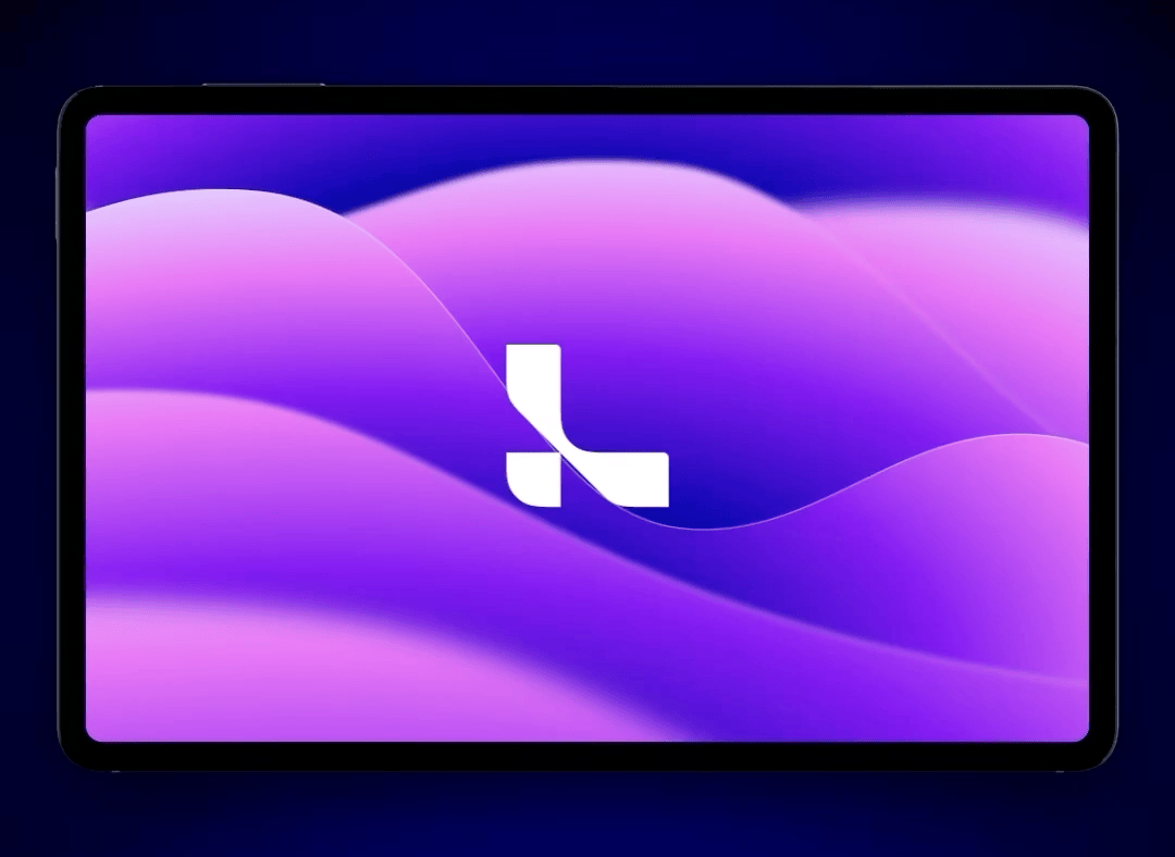
Leia 3D
Design System
Building foundational design infrastructure for the world's first AI powered 3D Lightfield tablet.
Case Study
My role
Built a complete 0→1 design system for AI powered 3D Lightfield displays, including depth-aware component patterns, navigation systems, and media controls. Developed brand systems spanning logo refinements, app icons, and semantic color tokenization.
- Component Library
- Design Tokens
- Figma
- Android
- Cross-functional collaboration
- Technical documentation
- Brand identity
- Iconography
- Typography
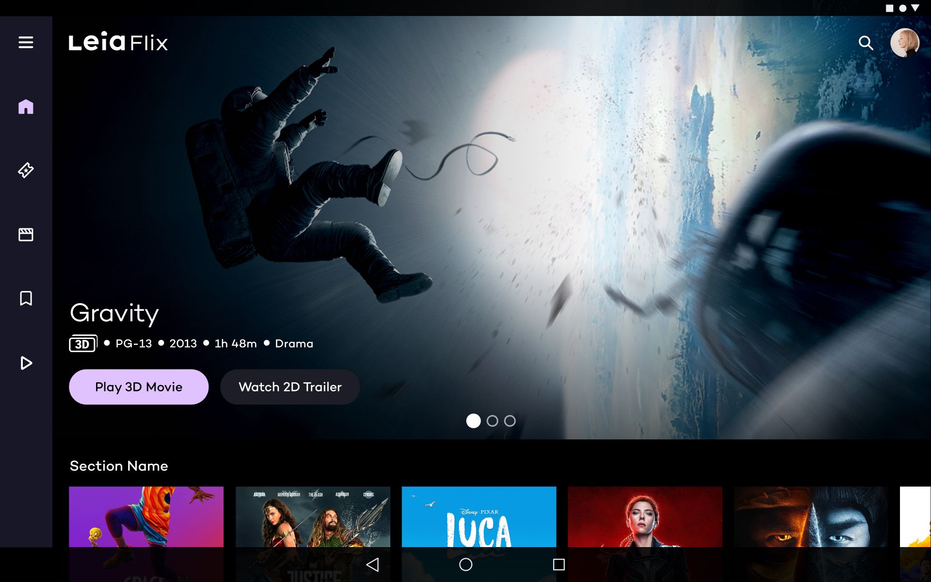
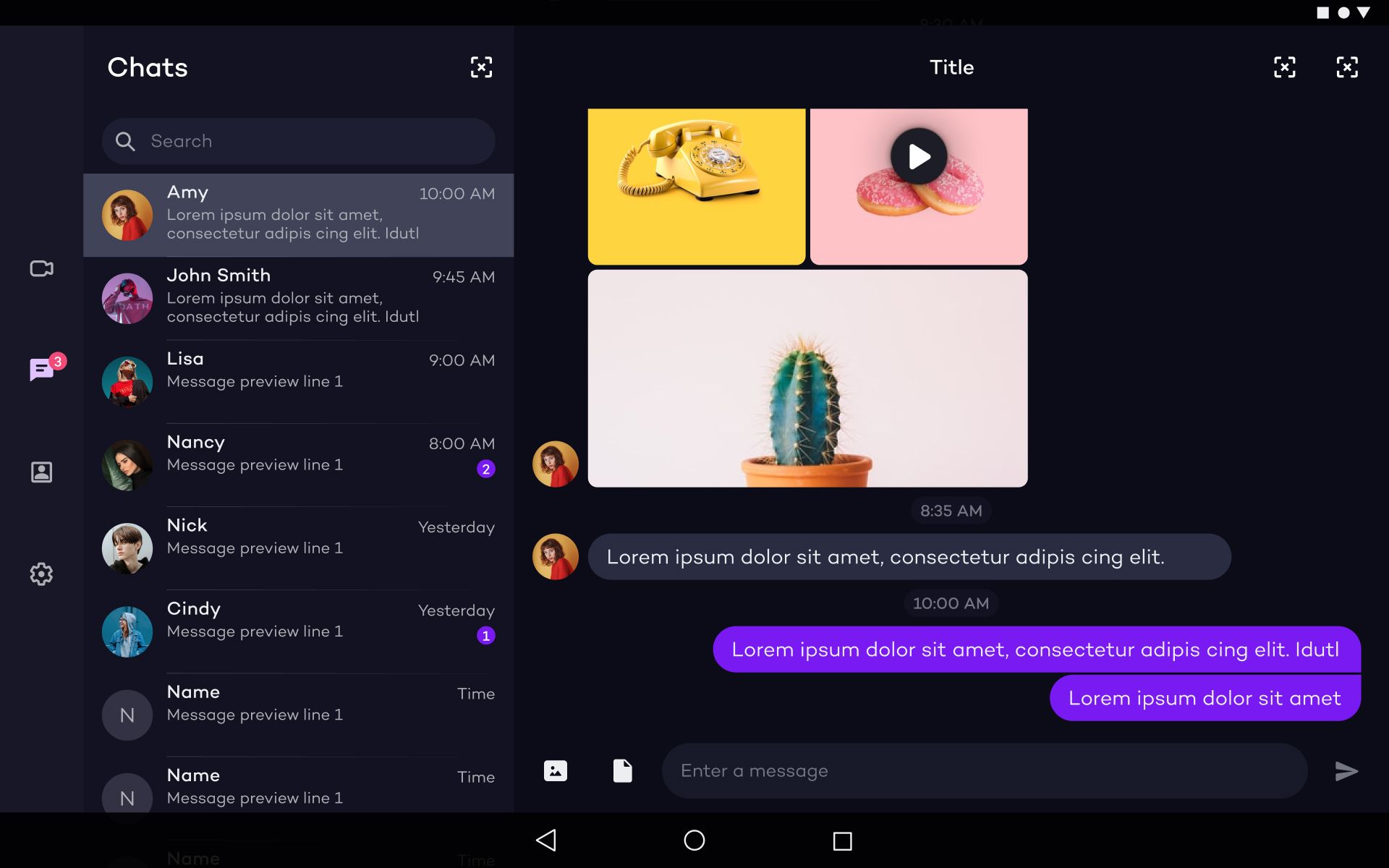
Leia's AI powered 3D display technology is groundbreaking, but their product ecosystem grew inconsistently. Apps built in silos looked and behaved differently, creating friction for users and inefficiency for teams. I built the design system that unified their visual language and established reusable patterns across their suite of apps in time for the Lume Pad 2 launch.
Brand Systems
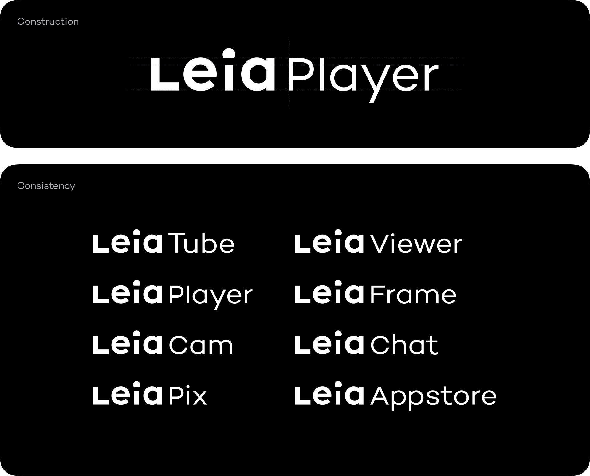
As a part of the push for consistency with the design system, I led a brand refresh to unify Leia's visual identity across all public touchpoints.
Logo refinements improved optical balance, custom product wordmarks established consistent proportions, and a consolidated color palette created cohesion between brand and product. This work ensured customers experienced one unified Leia, whether viewing marketing materials or using the actual products.
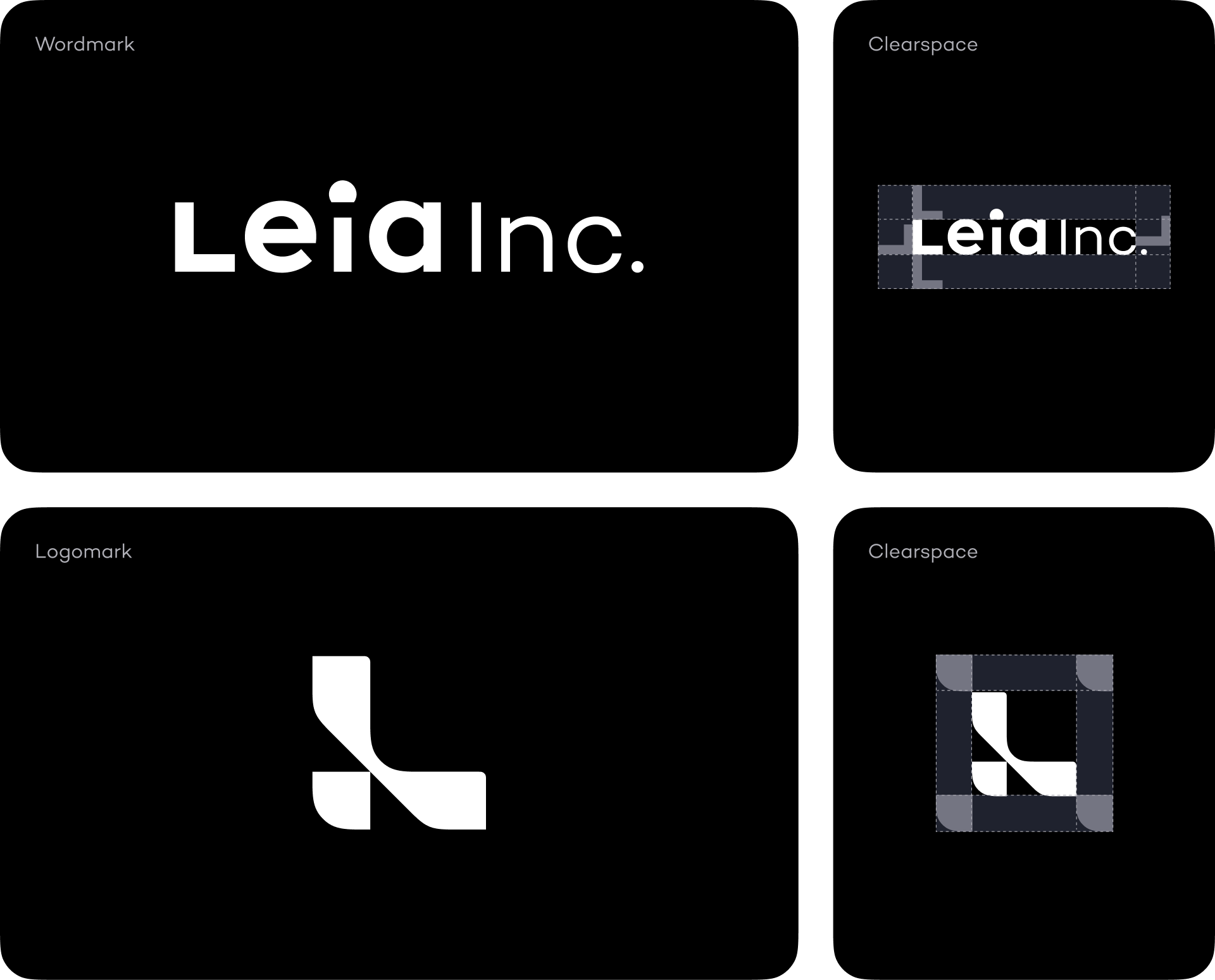
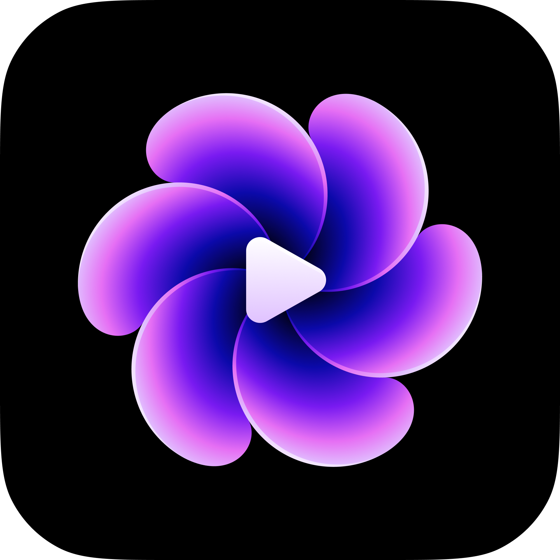
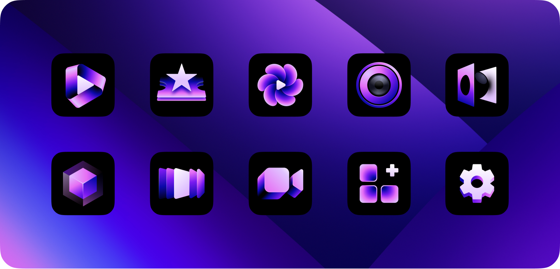
Redesigned app icon family to clearly communicate app contents and achieve visual unity as a set. Each icon followed consistent construction principles while remaining functionally distinct.

Design Foundation
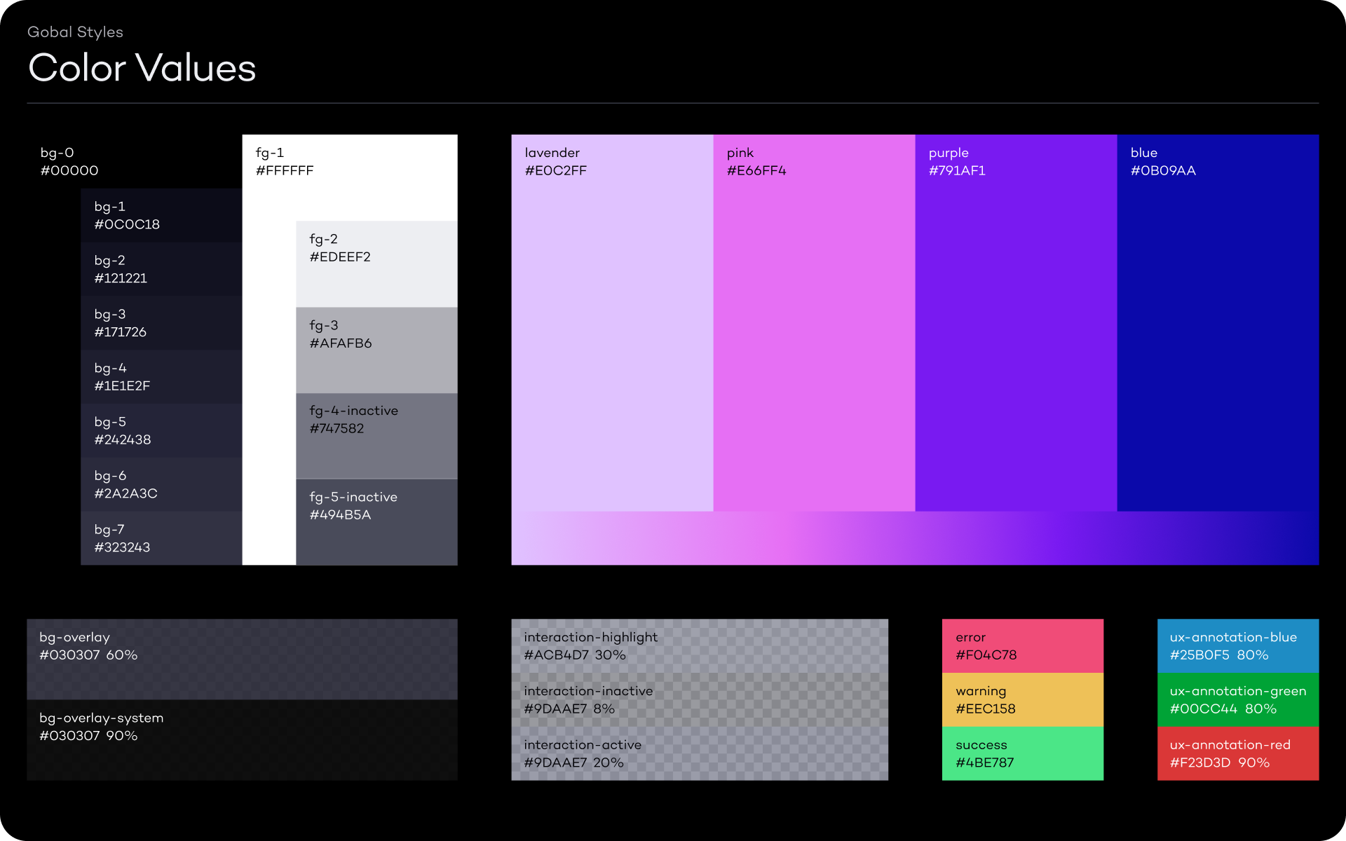
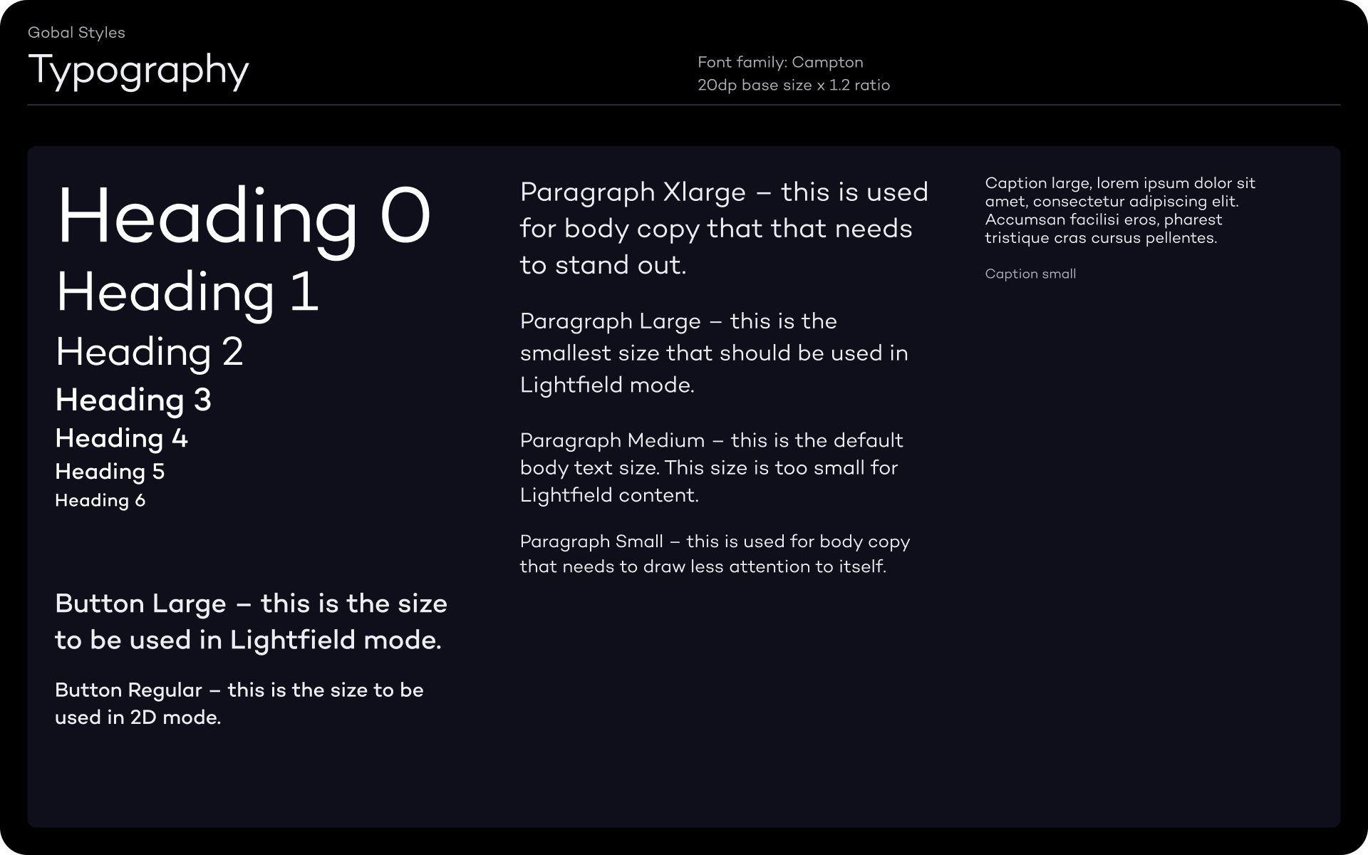
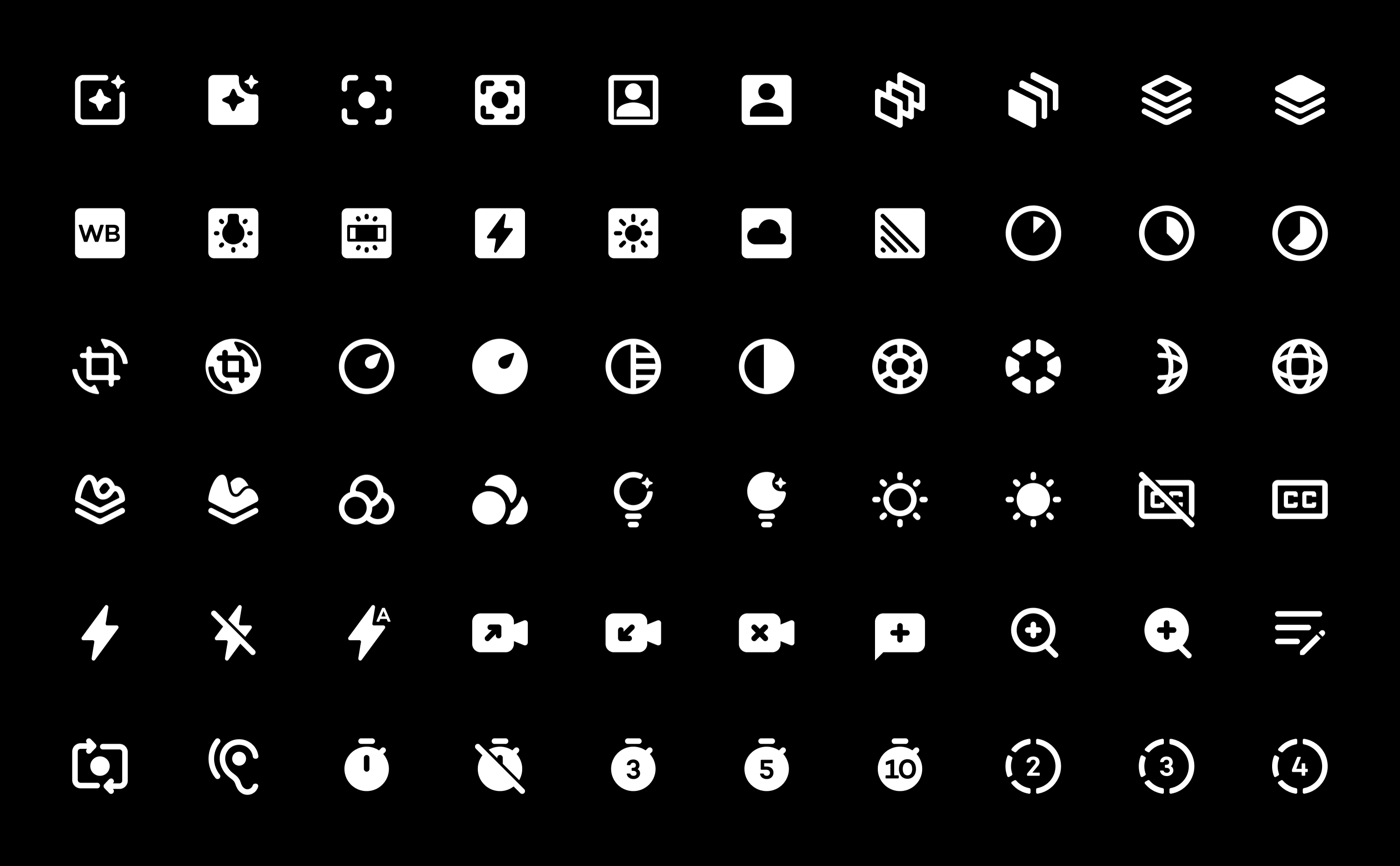
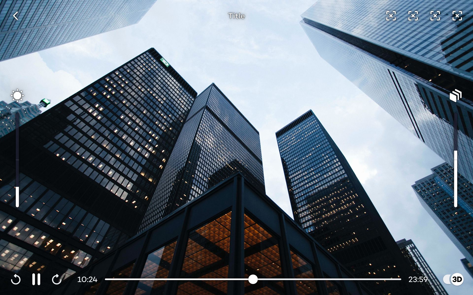
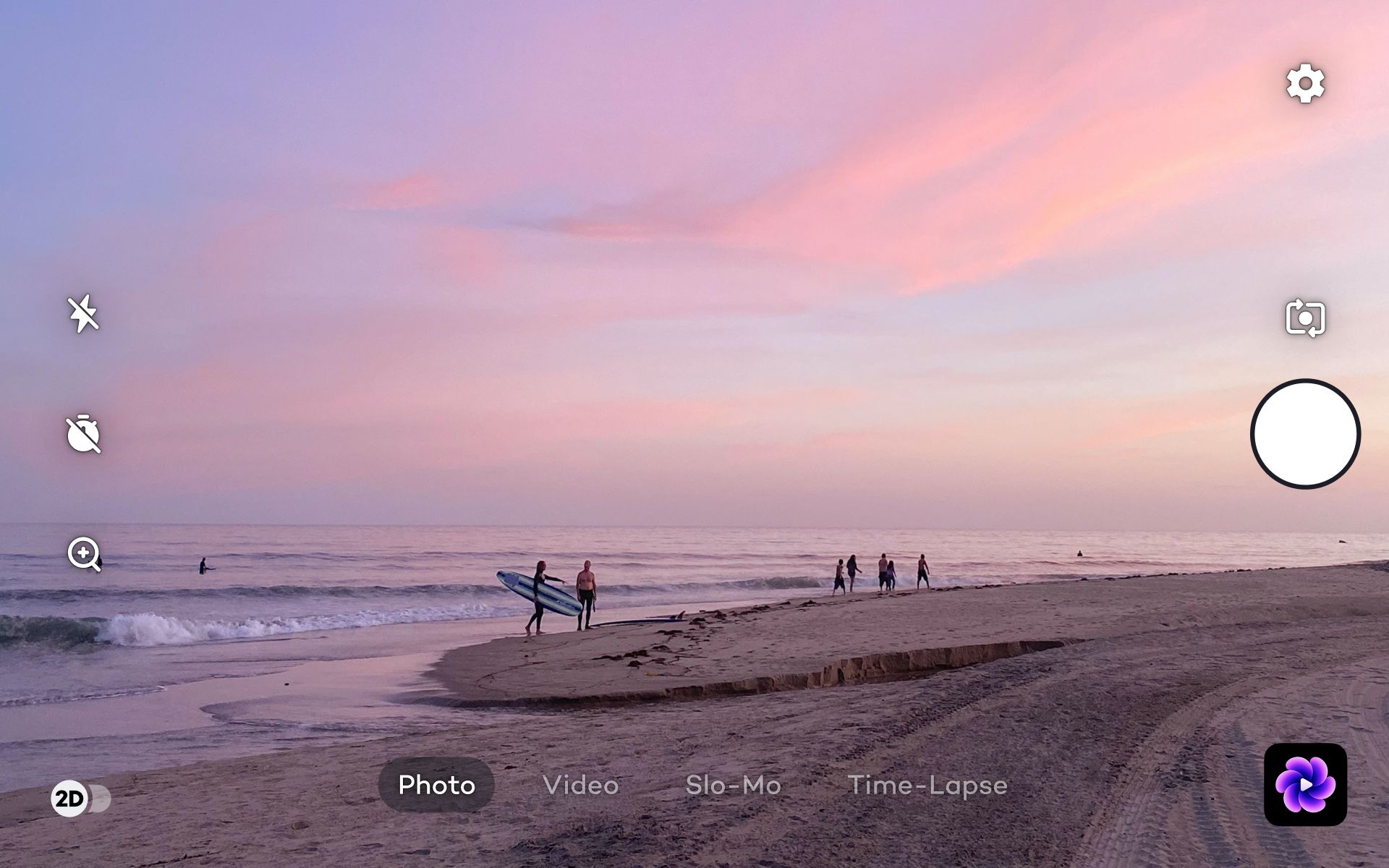
Established core design language for Leia's Android tablet ecosystem. I defined the grid system, color tokenization, typography scales, and iconography that extended Material Design conventions to address Leia's technical requirements. These foundational elements ensured visual consistency while accounting for how 3D content affects contrast and readability.
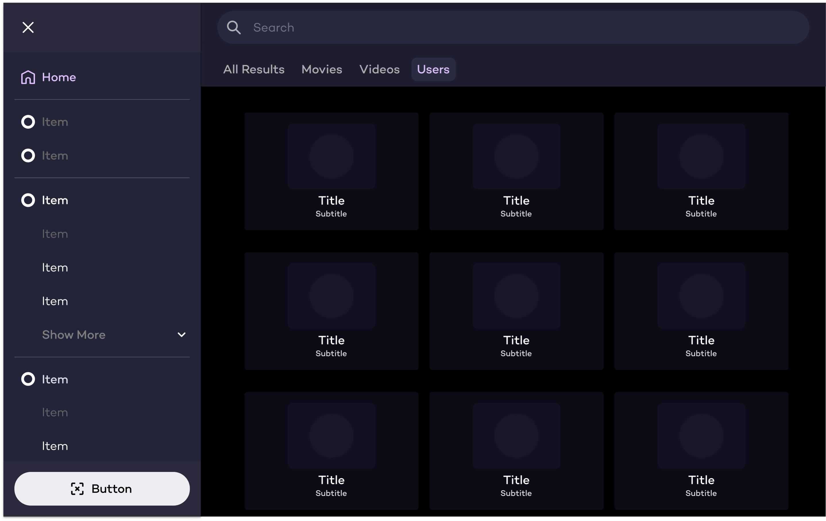
Component Architecture
Built comprehensive component library addressing Leia's technical constraints. Buttons and controls required higher contrast ratios to perform best on the Lightfield display. Navigation was optimized for landscape tablets, and media controls became modular for different viewing contexts.
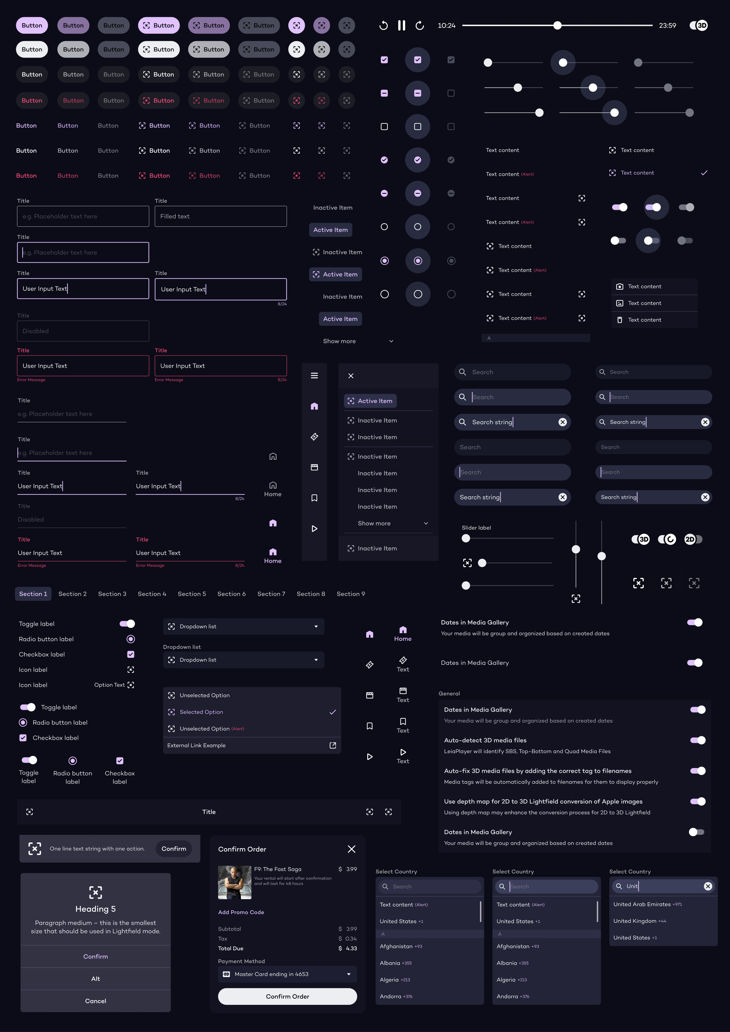
Established depth-based layering system where background shades indicate hierarchy. This approach gave designers a clear mental model for building interfaces that felt cohesive alongside 3D content.
Adoption Strategy
Drove adoption through phased app-by-app implementation. Held individual working sessions with designers to better understand component usage and gave them direct input on system improvements. Collaborated with engineering teams to maintain design-code parity, and presented regularly to stakeholders to keep product, engineering, and leadership aligned.
System Deliverables
- Buttons & ControlsUnified component variations with depth-adjusted contrast
- Form ElementsInput fields, toggles, and pickers optimized for tablet interaction
- NavigationSidebar architecture for landscape tablets
- 3D Media ControlsModular system scaled for Lightfield viewing
- TypographyBaseline grid system across depth planes
- IconsExtended icon library with consistent construction rules
- DocumentationTechnical implementation guidelines
Brand Elements
Refined logos, custom product wordmarks with consistent stroke weights, consolidated color palette using semantic variables integrated with Material Design.
Visual Language
Prism gradient motif, device animations, wallpapers creating cohesive branded experience across the product ecosystem.
The design system enabled Leia to ship a cohesive product ecosystem for the Lume Pad 2 launch. Within six months, cross-functional adoption was achieved and design-to-development time reduced by an estimated 75% as teams stopped rebuilding components from scratch. Elements of the brand system continue to influence the company's visual identity as it has evolved.
Results
- 10+ apps
shipped for Lume Pad 2 launch - 75% faster
design-to-development cycle - 50+ team members
adopted the system
selected work
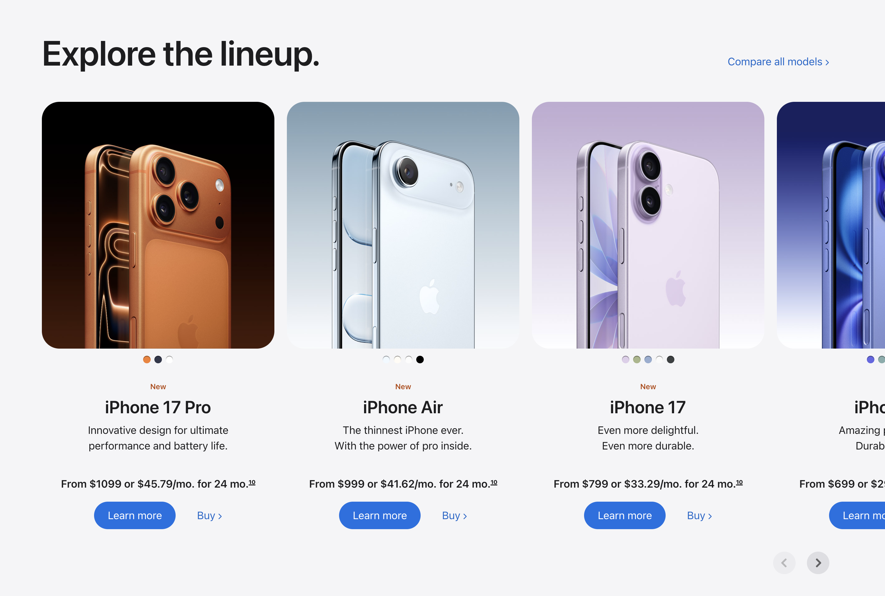
Apple
Architecting scalable design systems infrastructure for apple.com
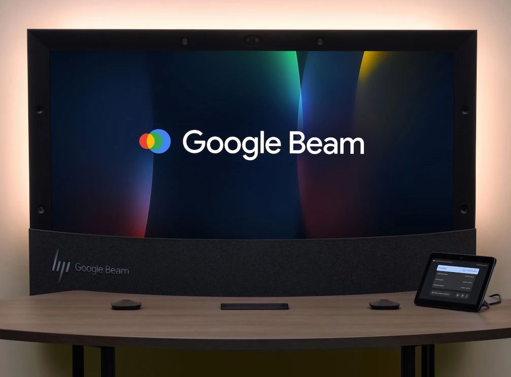
Google Beam
Building a design system for emerging 3D video communication technology
Motion design frameworks
Motion graphics systems and brand campaigns for mediums ranging from mobile campaigns to stadium graphics.
Brand identity systems
Brand identity, packaging, and art direction for consumer beauty brands